1.3 "SNIPE" UPDATE NOW LIVE!

Good evening patients.
I want to thank the dozens - DOZENS!!! - of folks who played through what Hikikomori WAS at launch. I was proud of what we accomplished in two weeks. However, those who played gave a ton of honest, constructive feedback and I wanted to make Hikikomori a better game overall - and I love polish.
This started as a PHYSICS update but, as much of the game was built around a poor physics system, some rebuilding of the game was required. As a result, this became a substantial update. If perhaps you played this game and were - say - unimpressed by the ~~terrible~~ artistic physics, do give it another chance.
The overall goal of this update, besides making Hikikomori more playable and accessible, was to preserve CHALLENGE but not be OBSTRUCTIVE to the player.
***UPDATE SUMMARY:
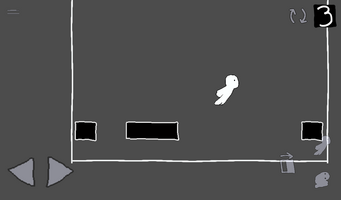
Thanks to all the input from you players, we implemented updates in five key areas: SCALING - Cameras have been made to give players a better view of the world and optimized where needed in particular instances. NAVIGATION - More guidance, while still minimal, has been given to the player, especially in the earlier stages, for a better onboarding to the game. INTERFACE - Mobile control UI has been overhauled as well as controller layouts, now with better response on analog joystick input. PHYSICS - Jumping, rolling, movement and enemy hitboxes are just plain better now. ENVIRONMENT - Improved hitboxes, graphics and other tweaks to make puzzles more manageable. Every stage has had a balance update in some way or fashion.
Or SNIPE, to abbreviate.
That’s the summary. If you’re a game dev nerd, we will get into the nitty gritty below.
***SCALING: No bones about this - the camera was way too close and OBSTRUCTIVE in many areas. This, particularly in enemy areas, made for an obstruction to players navigating the environment. There were also several smaller stages where the camera moved far too much for proper play and some were the camera moved to areas where it was not needed. The camera in EVERY STAGE has now been optimized for a better view of the action.
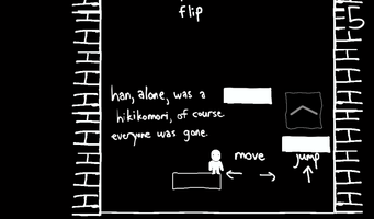
***NAVIGATION: Some players made observations that it was difficult to know where to go, (OBSTRUCTIVE!!!) especially since the direction changes nearly every stage. We have now added handy-dandy navigation arrows to give you a nudge in the right direction. We also added more action prompts to the early stages to help players ease into the game better.
***INTERFACE: Controller and touch screen inputs at launch were rough (OBSTRUCTIVE), at best, and apparently programmed by someone who has never held a game controller before. This is now fixed. Jump and roll commands are now on the face buttons and flip commands have also been added to the shoulder buttons to allow movement with both hands, which is recommended. The old style is still there if you prefer it.
Touch screen controls have also been optimized for better play. Left and right controls are now at the bottom left and action controls at the bottom right for more intuitive and comfortable input. In addition, the contrast on all the touch screen sprites has been increased and a negative backdrop added, making the touch controls more visible without obstructing the action.
***PHYSICS(!!!): By unanimous demand, we went and rebuilt the OBSTRUCTIVE physics from the ground up - which proved to be a large project. Jumping is no longer a goofy ramp arc and works as a more dynamic up and down. Stronger gravity and a better X movement while in midair now allows for faster falls and far more accurate jumping. Walking speed was also dropped and lerping added to allow better consistency moving along the X axis. Your velocity also no longer slows during jumps and is more consistent when moving from walking to midair and back.
Rolling has also improved. There were several instances in the game that were “roll tunnels” were players could get stuck (OBSTRUCTED) if they did not exit the tunnel before rolling. We have now fixed this and rolls now carry through in these situations and end upon exiting the tunnel.
Enemy physics also received an overhaul. Many commented on unforgiving, OBSTRUCTIVE hitboxes - which we agree. On a second and third playthrough, enemy luring (especially in midair) ranged from difficult to impossible. These hitboxes are more forgiving now. Also, when enemies get hit by roll attacks, momentum now transfers to the enemy and the player stops. This allows for attacks with more punch that create much greater distance between the enemy and player, allowing more opportunity for escape. In a strange unintentional bonus, enemy legs no longer kill on contact from above, allowing you to “sneak” under falling enemies if timed right. They will still murder you on touch, however.
One last physics touch - kuroshiro lamps - or, the switches that flip from light to dark in each level. Some mentioned that these feel redundant and I watched many videos of people struggling with them - because in their original state, they were OBSTRUCTIVE. We’ve given these a HUGE overhaul. They now have a larger “reset” radius around them so players can move around them and aim platforming better without flipping them a second time. We’ve also reduced their presence in game a bit - some levels relied on them far too much for level design.
***ENVIRONMENT: This began as a jumping fix. However, as we went through the game after fixing the jumping, we realized many levels were built around a broken OBSTRUCTIVE system. Because of this, many levels have received tweaks and rebalancing and - in a few cases - complete redesigns! We want players to be able to conquer levels using skill, not luck - and not in annoyingly narrow methods if possible.
Another fix - did you know there were STATIC platforms? These are platforms that DO NOT DISAPPEAR when flipping. Yeah! Helpful, right? What’s way MORE helpful (and not OBSTRUCTIVE) is knowing where the hell they are located. These now have a contrast outline to differentiate them from regular flipping platforms, which will make planning platforming routes WAY easier. In addition, we added more contrast to the wormholes/portals to make them more visible in certain stages.
What changes were made to levels (besides small camera tweaks)? Well…..
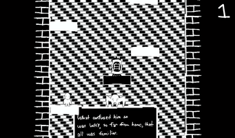
- Level 01 : better tutorial prompts and more platforms
- Level 02 : roll tunnels fixed and additional solution route added
- Level 03 : lamps now do not flip until player is more than two sprites away, less lamps now with more tutorial prompting
- Level 04 : more platforms added to increase verticality and some platforms increased in size for easier jumps
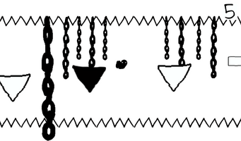
- Level 05 : redesigned, platforms rearranged and added for better navigation
- Level 06 : roll tunnel now extended with a snappier solution route
- Level 07 : enemy platform now extended, enemies easier to lure
- Level 08 : more platforms added, roll prompts
- Level 09 : level can be viewed in full, portals now route better
- Level 10 : platforms added and additional route added for solution
- Level 11 : camera only moves vertical, portals at top of stage removed
- Level 12 : level redesigned, lamps greatly reduced, enemy presence increased
- Level 13 : portals rearranged and spaced for easier aiming when falling, cam backed out for great visibility (solution slightly changed)
- Level 14 : camera now views whole level, some platforms and enemies removed or rearranged
- Level 15 : more lasers, more flips and better luring opportunities against enemies
- Level 16 : level moves slightly faster, does not feel as “floaty”
- Level 17 : mist redesigned, enemy detection and speed improved
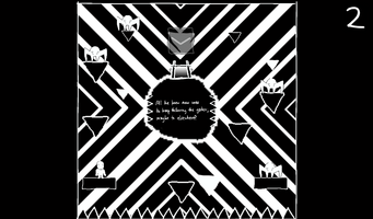
- Level 18 : the planets now have an orbit that players can jump into and release with any direction. This makes the space level more interesting, more fun to play and more of a setpiece.
- Level 19 : the camera has been backed out for a better view, speed dropped for better aiming and more visual feedback to differentiate portal areas has been created.
- Level 20 : platforms moved and camera optimized for better navigation
- Level 21 : more platforms added and camera now only moves horizontal
- Level 22 : enemy luring easier and lamps now flip less easy
- Level 23 : platform sizes changed and more added for more evasion opportunities, also a prompt for the “gate”
- Level 24-30 : camera improvements
Files
Get Hikikomori
Hikikomori
A primitive 2d puzzle platformer from beyond this world.
| Status | Released |
| Author | negative_development |
| Genre | Platformer, Puzzle |
| Tags | 2D, Atmospheric, Black and White, Creepy, linux, Short |
More posts
- Hikikomori Is Now On LinuxAug 17, 2024
- Soundtrack Now Available at BandcampOct 20, 2023
- 1.3 UPDATE COMING SOON - (To-Do List)Aug 13, 2023
- 1.2 Update - Quit now works in browser!Aug 11, 2023
- 1.1 UPDATE - UI, Windows Exe, Mobile Controls and Optimizing.Aug 10, 2023
- Hikikomori - Screenshots wantedAug 07, 2023

Comments
Log in with itch.io to leave a comment.
I'm super impressed by the amount of work you put in on this update! In game and in communications.
Thank you so much. I also appreciate your feedback immensely (and bravo - I think you may be the only person who beat the original version!) Glad to see you appreciate the upgrades - which are thanks to all who played, including you. Thank you for being here.